Kupid’s Kalling
A design collateral for a fictitious music festival with visual presentations such as logos, poster, advertisements, and a co-brand project
Overview
Project Summary
The purpose of this project is to develop a comprehensive and compelling visual representation that encapsulates the imagined festival's core values, themes, and overall atmosphere. It is also to create a powerful narrative that immerses the audience in a vibrant and impressionable world, evoking emotions, and establishing a lasting memory in the minds of festival-goers.
Kupid’s Kalling
This is a K-Pop music festival, hence the intentional misspelling in the name to align with the genre. The core of the festival is celebrating the emotions of modern romance, all the good and bad. The goal is to be inclusive and make everyone feel loved with a heartwarming experience. This festival is held in Paris, also deemed as the “city of love.”
Personality
Logo
Because this festival surrounds the idea of modern love, the pixel element ties back to the use of technology to communicate our feelings. In the logo, Cupid is shown to be doing the finger heart, which is a gesture that is popularized by K-Pop industry. I aimed to make a minimalistic yet fun logo that evokes playfulness with a dash of nostalgia.
primary logo
primary logo (black)
primary logo (white)
secondary logo
secondary logo (black)
secondary logo (white)
Brand Colors + Typeface
Wink is a deep pink that serves as the primary color to align with the festival’s energy and atmosphere. Muse is a lighter pink supplementary color for visual harmony and enhancing the depth of the brand. Pearl and Velvet are used for contrast to build visual hierarchy while making the color palette more balanced and timeless.
By combining Gotham as the primary font and Roboto as the secondary font, the brand achieves a balanced typographic system that captures the desired minimalistic and modern aesthetic. The two fonts work together seamlessly, offering an approachable appearance with strong professionalism and readability.
Campaign Poster
Digital Advertisements
Social Media
I aimed to create an Instagram feed that effectively aligns with the brand colors, while maintaining a minimalistic aesthetic that appeals to Gen-Z, and paying homage to the festival's retro vibes.
Co-brand
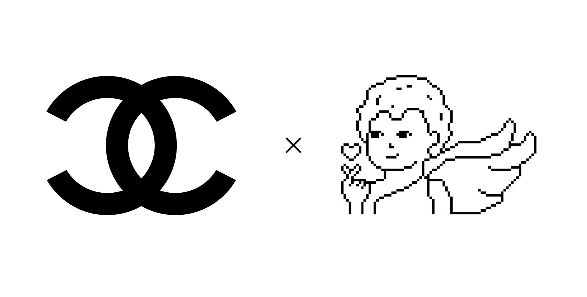
I decided to collaborate with the iconic luxury brand, Chanel, that originated from France. I applied the pixel art element of the festival logo onto the Chanel logo to allow for a cohesive aesthetic of both brands.
Lipbalm
Seoul Amour is a unisex hydrating lipbalm that captures the essence of Korean charm and French elegance. This product reflects the feeling of romance and preparing your lips for whatever rendezvous you have planned.
Lipstick
Pomegranate Pout is a rich and sultry deep red lipstick that exudes luscious energy. The shade is universally complementary to a wide range of skin tones. The high pigmented formula ensures long-lasting colors for you to rock this alluring lip color all day long.
Cotton T-Shirt
Crafted from soft and breathable cotton fabric, this t-shirt combines comfort, style, and a touch of whimsical romance, making it a perfect addition to your casual wardrobe. It’s a fashionable and comfortable piece that allows you to express your romantic side while embracing an effortless style.
Chocolate bars
The flavors combine two ingredients that are traditionally and culturally significant to Korea and France to create a harmonious blend of both cultures. The fusion results in an extraordinary and distinct chocolate experience.
Gift Bag
The Chanel gift bag represents the embodiment of luxury, timeless style, and exceptional craftsmanship that make the brand an unmatched symbol of sophistication. The pink interior of the bag creates a soft and delicate aesthetic that makes it a perfect vessel for other precious merchandise.
Perfume
Amor’s Arrows is a unisex perfume that invokes a sense of passion, enchantment, and romantic connections. The top note opens with a burst of juicy citrus with base notes of sandalwood and creamy vanilla. This scent is perfect for any occasion and leave a lasting impression of love.
Touchpoints
Here are some additional design assets that will not only enhance the overall user experience but also strengthen the brand's presence.
Staff Badge
Staff Shirt
Wristbands
Short Animation


